


-
Algo Eco-Friendly Paint - Sweet Violet
Regular price from From 0,00 € ttcRegular priceUnit price 49,40 € ttc per l -
Algo Eco-Friendly Paint - Everine Violet
Regular price from From 0,00 € ttcRegular priceUnit price 49,40 € ttc per l -
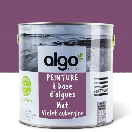
Algo Eco-Friendly Paint - Eggplant Purple
Regular price from From 0,00 € ttcRegular priceUnit price 52,40 € ttc per l -
Algo Eco-Friendly Paint - Mauve Sky
Regular price from From 0,00 € ttcRegular priceUnit price 49,40 € ttc per l -
Algo Eco-Friendly Paint - Petal Mauve
Regular price from From 0,00 € ttcRegular priceUnit price 49,40 € ttc per l -
Algo Eco-Friendly Paint - Purple Dancing in the Rain
Regular price from From 0,00 € ttcRegular priceUnit price 52,40 € ttc per l -
Algo ecological paint - Margaux Island
Regular price from From 0,00 € ttcRegular priceUnit price 52,40 € ttc per l -
Peinture écologique Algo - Mauve Charme éternel
Regular price from From 0,00 € ttcRegular priceUnit price 52,40 € ttc per l


Choose your colors with ease
-

Find the perfect shades with our color consultant
Book your free coaching -

Easily choose your shades with our samples
See our 100 samples -

Fall for our magnificent color harmonies
See our color harmonies


-

Fast delivery
and neat -

A service
top customer! -

More than 2000
verified reviews -

Payment
secure


A color rich in meaning
Purple embodies a wide variety of meanings: luxury, royalty, and creativity. Purple gets its distinctive shade from a combination of blue and red, or even pink depending on the intensity and depth of the magenta.
The spectrum of purple shades varies according to the depth of the shades: we offer very soft purples or, conversely, rather dark ones. If red embodies passion, blue is a color that evokes calm and serenity.
Shades of purple are basically balanced colors that can combine the passion of red and the serenity offered by blue.
It is true that purple has not always been fashionable in painting like orange or red, but it remains a nuance full of meaning that makes it a color completely apart from the color wheel.
Our different shades of purple
A purple shade will give a feeling of softness, conversely a plum or magenta color will play on the personality and sophistication of the place in which it will be applied.
We recommend using light tones for small spaces, such as colors close to lavender or lilac, which will be perfectly suited to small spaces.
In larger rooms, using deeper purples will add character, especially if the space is well-lit. To create a harmonious space, purple should still be applied in small touches, or on a single wall at most, especially if it's dark.
Don't hesitate to look at inspirational visuals on Pinterest to help you find the perfect shade of purple for your interior.
The exuberant pink:
A color that can be considered feminine, it's a shade that will undeniably help define a space. In a bedroom or office, using this purple color will allow you to assert your personality.
An intimate purple shade, you will achieve a refined balance if this color is combined with a shade of white.
The sunny plum:
This purple has a solid reputation for being intimate and deep. Dare to try it; it has everything going for it. Like many shades in our purple collection, we recommend applying it in small touches to complement an existing decor and harmony.
In a bedroom, our charming plum color will be perfect!
Sweet purple mauve:
This lavender-like mauve is soft and, by definition, much easier to work with than our dark mauve collection. Be careful, however, as this shade can appear cool if applied in too large a space or if applied in too large a quantity.
Mauve Everine:
This is probably the easiest purple to apply in an interior: a color with gray tones, complete this combination with neutral and soft shades to fully exploit the power of this beautiful purple. We particularly recommend its use in a bedroom or an office.
Purple Sky:
Like "sweet violet," this shade, close to lavender, is even more neutral and soft. This lilac-hued purple from our shade collection is ideal for rooms lacking natural light.
The drawback of this type of shade, however, remains the coldness that this purple hue can give off. To avoid getting tired of it quickly, the ideal is to combine it with more vivid and dynamic colors.
In which room to apply shades of purple
The visual impact offered by purple can vary greatly depending on the shade: in fact, depending on the length of the room, a soft shade will visually enlarge the space, while a darker color will provide a more personalized and sophisticated background.
Purple is a color that is applied in small touches; it is very rare to paint a room entirely in purple.
The first reason is that visual balance must be maintained as much as possible, explaining why it's important not to overload the room with purple elements. This is also demonstrated by the numerous inspirational visuals available on Pinterest.
The bedroom:
This is the room in the house where it's easiest to apply purple. A crucial and intimate space in a home, a purple shade will stand out perfectly. Combining relaxation and creativity, using a mauve shade may seem daring but is perfectly at home in a bedroom.
The living room:
You can easily pair it with purple or deeper violets. Of course, it's easier and more recommended to pair mauve shades with softer, neutral tones.
Applied sparingly, purple will find its place in your living room, which is a room with a length and width that allows for a few eccentricities!
The office:
We don't always think about it, but the office is a room that is an integral part of your home and is increasingly used with practices linked to teleworking.
Purple is defined by its ability to promote creativity and relaxation, which is why its presence is not unusual in the background of a room or office.
Orange, black... what color should I use to apply purple?
Purple is rarely used as a total look regardless of the current trend, which is why it's important to create a palette to balance the boldness of purple with other hues, as suggested by the many purple visuals posted on Pinterest.
Even if tastes and colors are not discussed, it will be easier to use beige, white and gray as a priority, which will allow you to nuance the purple with other shades and above all to bring a certain elegance.
Bring more personality to the room with more dynamic and complementary colors like yellow and green.
Shades close to purple are also excellent alternatives: pink and blue are among them.
Warm white:
It's the perfect shade to complement your purple, and Pinterest won't prove you wrong! While purple can be a trend-defining color, white is completely timeless, which means you won't get tired of the combination.
Another major advantage is that using white will allow you to keep as much light as possible in the room.
The other purples in our collection also remain excellent alternatives.
Blue:
The blue spectrum is very broad, and this also applies to all the blues in our collection, but the violet shades can be very close to different blues, especially dark ones.
In large rooms, dark blue can be a nice alternative, but in smaller rooms with less natural light, the idea would be to use a softer blue.
Black:
This original combination can be attempted and even successful depending on the type of room in which you imagine it. Our black Piana will give the space a certain refinement.
Use it sparingly, even though its elegance can make you want to use black excessively. It works perfectly for delineating a space or with geometric shapes, for example.


